June, 2015
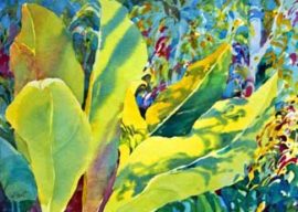
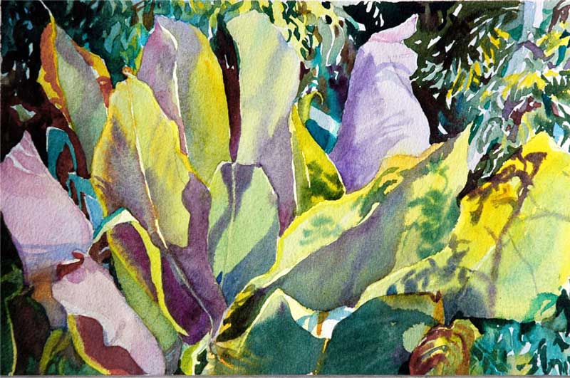
One of my favorite subjects to paint in Costa Rica are the blue leaves that line the highway along the southern Pacific coastline. Whenever someone says to me that I must get tired of painting green in Costa Rica, I think about these leaves – where I see lavenders, and yellows and oranges and purples and blues and chartreuses and…oh, yes, greens. I especially also like the opportunities to paint the ultra busy layered background and the back light and cast shadows.
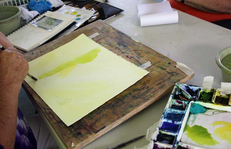
This leaf demo was begun in March, 2014 at a watercolor workshop here in Costa Rica. Grieving the sudden unexpected death of my husband, Frank – just days before, I was welcoming the soothing opportunity to concentrate on leaves and shadows and glazing….. One of the students snapped some shots as I painted. I began with an under wash of aureolin yellow simply because the subject includes lots of light – back light, glow, intermittent light, direct light.
With most subject I paint, I like to work directly, leaf by leaf so that I can experiment, take advantage of working wet into wet, etc. Looking at the main leaf, I saw the soft edged ‘stripes’ of cooler blue/green so I decided to work wet into wet.
I first layed in a bright layer of green gold and while it was still wet, I directly added some brush strokes of dryer Ultramarine Turquoise (DS). I knew that as long as the ultramarine turquoise I layed in was dryer than the greengold wash below, it would mostly stay put and not suddenly spread out of control through the wet/damp wash. I wanted the soft edges. I also knew that it was darker and stronger than I wanted – but – watercolor always dries about 50% lighter….so going in strong is not at all a bad idea. I added in some quinacridone magenta, too – to see what it would do and to introduce that color into the painting. I took care NOT to overwork. Once my brushstroke was down, I stopped. I could always go back later (after it is dry).
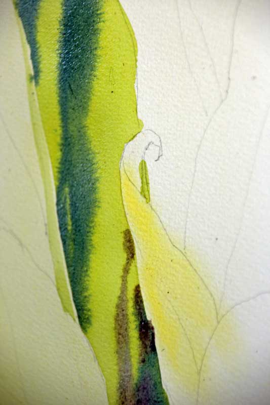
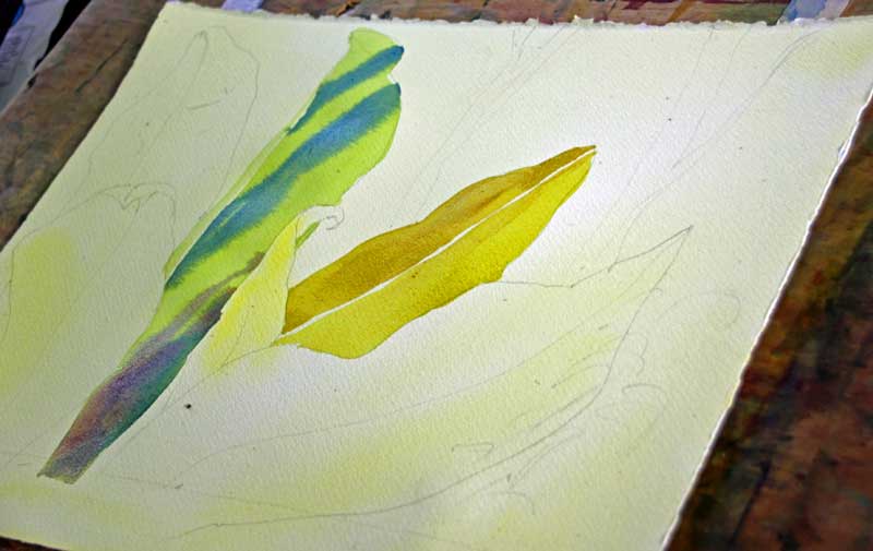
I continued on to lay down the under color for the back diagonal leaf that would have some interesting patterns of back light and shadows. I kept the central vein light. I was working fast, hitting my stride – and decided to immediately apply in the dryer and darker cast shadows, wet into wet – and let it get really dark on the right side of the leaf, always remembering that I love to leave a bit of the wet under color to show through…
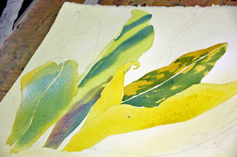
Next, I painted the very bright yellow under color of the foreground leaves to the right – and quickly added on the dryer ultramarine turquoise with some cobalt blue using my rigger, to achieve some dancing like strokes. Then I quickly turned to the interesting leaf on the right, that reminded me of a cobra about to strike. Upon the yellow under color I added some cobalt blue, a bit of ultramarine turquoise mixed with cobalt blue and took care not to disturb the central vein and the edges of the leaf where I wanted the yellow to show through.
It was just about as far as I would get that initial time. But then my students asked about the dancing stroke I often talk about. How can one deal with the zillions of leaves and layers in the jungle beyond the subject leaves without getting so busy that it becomes a pointillistic nightmare?
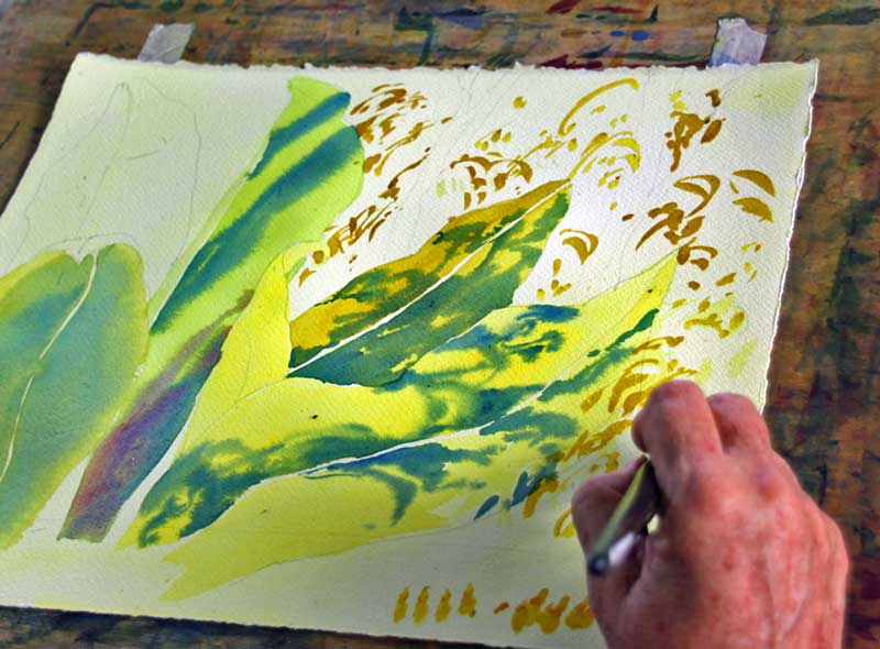
And so I talked about the Dancing Stroke and began by using nickel azo as the color of choice. I explained that if you look at the actual photo, you see that the branhes and leaves in the background have a characteristic flow to them. They are not at all polka dotted or arbitrary. And so the strokes I use as an artist are also flowing, as if I’m painting some of the leaves that are connected to branches and branchlets that aren’t even visible. I continued to use the edge of my 3/4″ flat wash brush (which I use for 90% of my painting) and left plenty of space around the gold colored leaves that danced, often continuing a flow of directionality from the foreground leaves. Also note that I did draw in the suggestion of a trunk or two to help with the layering feeling. At the bottom of the painting shown you can see that I talked about what NOT to do. Polkadots. Identical shapes in a row. Try to imagine that you are simply painting some of the leaves that are picking up the golden color as they shimmer in the light. After doing this with Nickel Azo, I did it with some Quinacridone Magenta. Then some Cobalt Blue. Then some Ultramarine Turquoise. The trick is to do it sparingly enough so that you leave some of the light yellow background, that will be glazed with cobalt blue. So you are painting the dancing strokes knowing that eventually you get dessert. Glazing!
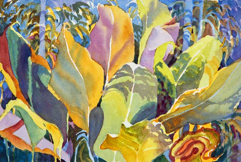
Over a year later I returned to this painting and finished it.
- I glazed several times with cobalt blue. The lightest ‘branches’ and ‘trunk’ shapes just got one layer. The lower right and upper left got several. I had to take care not to cover the original yellows completely and turn them into green.
- I tucked in some dark darks here and there to emphasize the places between leaves or accentuate a pleasing pattern.
- I repeated the deep magenta and was so very happy that I’d put it in early and recalled how scary it was to do that!
I’m pleased with the results of Grief Leaves and look forward to the next time I paint these wonderful leaves! Come join me for a workshop or an intensive and we’ll do the Dancing Strokes together!
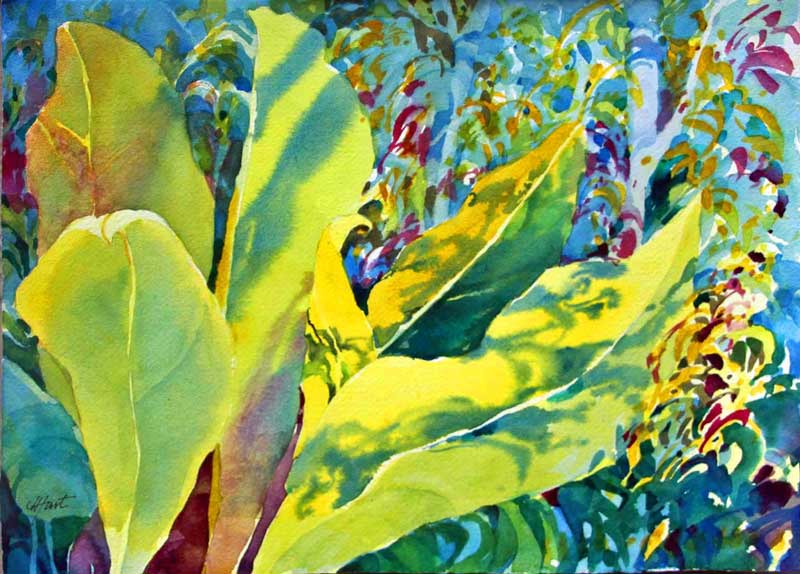
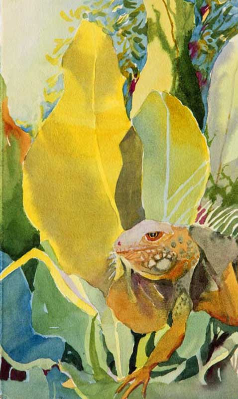
Other renditions of the Blue Leaves series….
Here is my sincere offer.
Email me and I’ll send you a good jpeg of the blue leaves that you can print out paint on your own. All I ask is that you send me a jpeg of what you do so I can see if my description was at all helpful. I’ll gladly send you a few words of ‘off the top of my head’ critique back if you participate. Thank you! Jan.