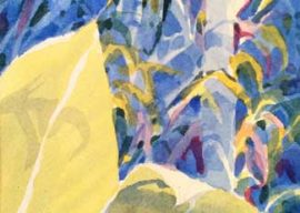
Dancing Stroke Demo – A closer view of the process
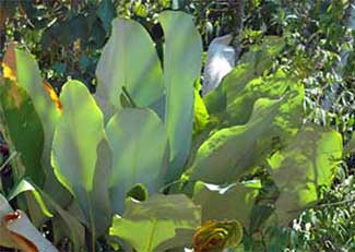 Lets take a look at the step by step process I use to paint the background using my favorite photo of the blue leaves.
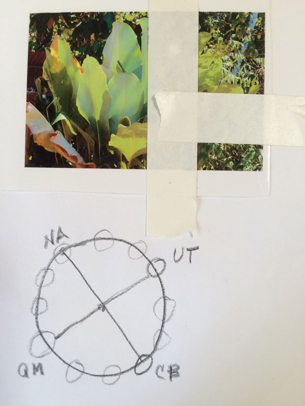
I tape off in order to isolate the upper right hand corner of the photo. Then, as I generally do, I decide on a color scheme. In this case, because I used it in an earlier example of the dancing stroke – I choose a tetradic scheme of two complements, separated by two color steps. (refer to my color Part 2 Tutorial for more info about color schemes.)
My selected paints are:
- Nickel Azo (PY150)
- Cobalt Blue (PB
- Quinacridone Magenta
- Ultramarine Turquoise
Using these colors I can get the greens I want and the Q Magenta and Ultramarine Turquoise will offer enough strength for the darks I need.
I also reserve the right to cheat a bit and use Aureolin yellow (PY ) for an underwash.
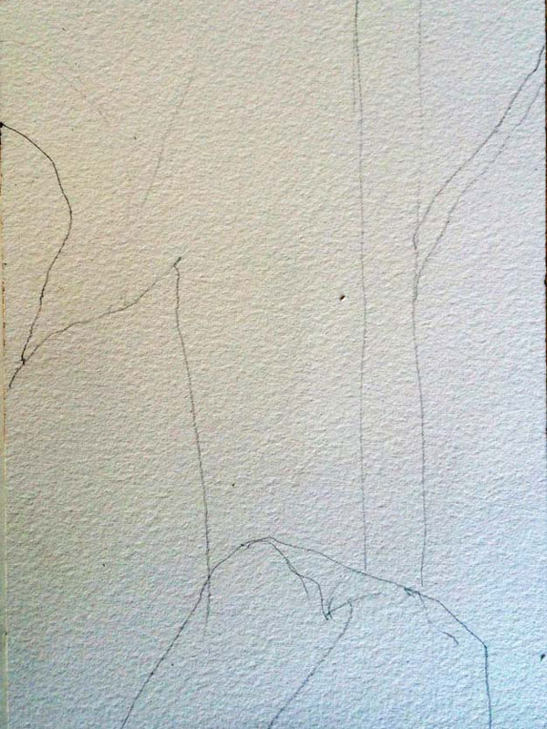
I sketch lightly onto the paper – paying some attention to creating a vertical tree trunk instead of the diagonal trunk I see in the photo. Why? The vertical will help stabilize an organic subject that is already full of potential movement. Also, I indicate a possible branch and some drooping strokes (barely visible) that indicate the drooping leaves and branches I see in the photo.
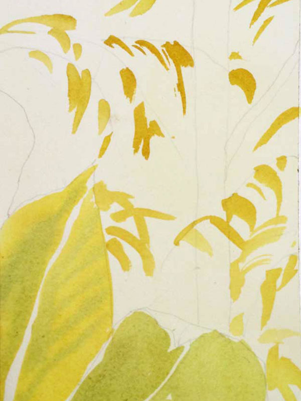
I then apply an all over wash of Aureolin yellow. Why? I simply like to think of it as sunshine…and became quite accustomed to an underwash in New Mexico. (photo error – the yellow was applied uniformly)
I like thinking in layers. First the sunshine…. Later I will apply shadows and shade..
After the paper is completely dry, I start to paint – first putting in the foreground, or the leaves using a mix of NA and some cobalt blue…. Normally I would spend more time on them, but I’m eager to get to the subject of this demo – the Dancing Strokes of the background! I see that I completely forgot about the suggested leaf on the far left. Oh well.
I begin the dancing strokes with yellow. Nickel Azo. And my dancing stroke will be pointed, as are the ends of the leaves I see in the photo. I don’t intend to put in all the leaves I see – but just some of them.
Using just the corner of my ½” flat wash brush, I flick in the gestured strokes noting that the end of the leaf stroke is pointed. In my visual mind I am thinking branches and leaves – and I am also thinking about clumps with lots of space inbetween the clumps.
What I do NOT want is polka dots.
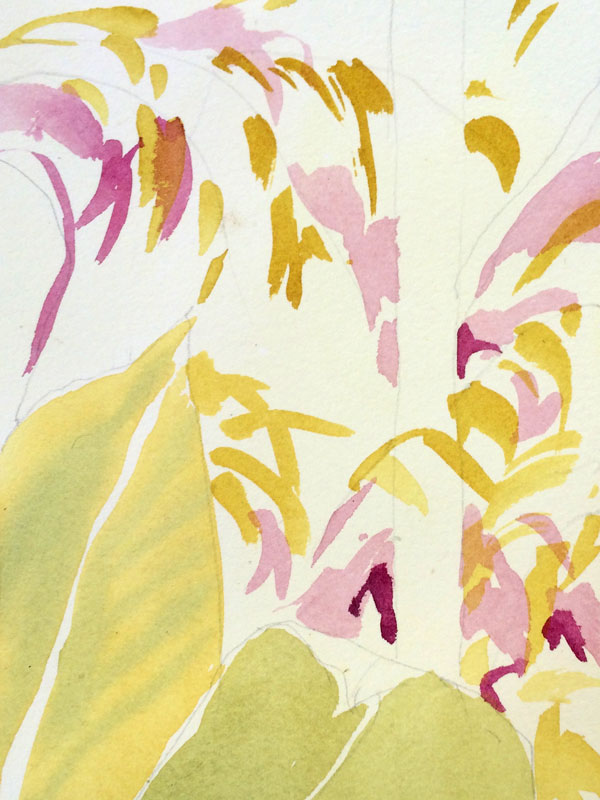
Next – using Q Magenta – full strength and also diluted with water, I flick on some more dancing strokes – strategically. I lay them in next to or around the already painted yellow strokes and keep the gestures similar.
Nature is ordered – in often repetitive patterns. .
And we are building a sense of nature – in the background and in the shadows with flickers of light.
We are NOT building polka dots or confetti.
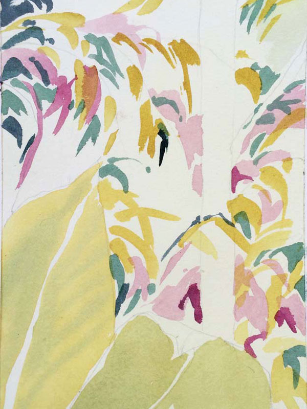
It is time to play with some of the ultramarine turquoise!
And again – I am painting dancing strokes strategically. I am not covering up the yellows or the magentas and pinks. And I am trying to avoid covering up the branch on the vertical tree trunk – but I see I’m erred a bit.
I like to use the dark paints like Ultramarine Turquoise – to clarify the dark corners I want – upper left and possibly lower right. I have in mind that because the lower left is yellow toned, I’ll be repeating that in the upper right… Kind of a cross diagonal composition plan…
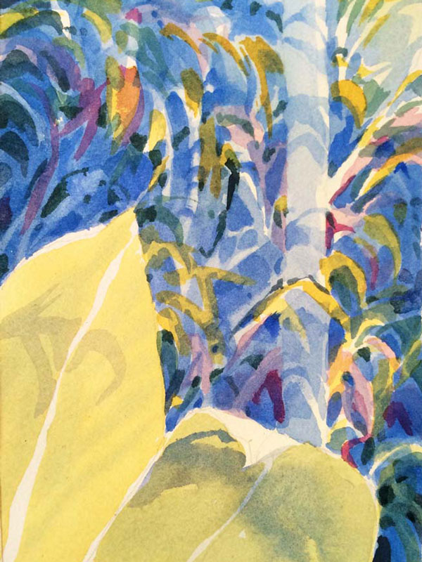
Finally – we’re ready for some Cobalt Blue! This transparent paint is one of my very favorites – and I like being able now to use it to fill in a lot of the left over space. I also keep in mind that I want to save some lights!
Say that again. SAVE SOME LIGHTS.
I paint cobalt blue as a selective GLAZE. I’m covering space but also being careful to go around a lot of the existing pink, turquoise and yellow shapes. I know I’m safe to use cobalt as a glaze here because I am thinking in Layers – a glaze of cobalt over magenta creates a lavender; over yellow creates a green. I also paint the initial shadows on the tree trunk being careful to round them for perspective on a curved surface..
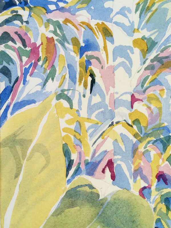
Another GLAZE of cobalt blue – strategically. Again I am careful to think where I want to save an underlying yellow or pink so I use a glaze as if I’m also negative painting – around shapes.
Now, after letting it dry, I come back in with some darker notes of cobalt blue . I like that I have still saved my lights, particularly on the trunk and branch and here and there isn the gestured shapes.
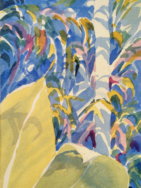
Finishing!
These two photos are best looked at side by side so you can see where I’ve gone back in – to accentuate, etc.
Left photo: On the left I have added another layer of cobalt blue – glazing over a lot while still leaving a few colored or light shapes. Mostly I glazed:
- Upper left and lower right – to darken those places
- Over the left side of the tree trunk
Right Photo: My glazing over much on the left diminished some contrasts that I would like to get back again. So – I go in with Finishing touches of very dark darks – a mix of Ultramarine Turquoise and Q. Magenta. A dark dark for sure. You can see places where I’ve accentuated some shapes.
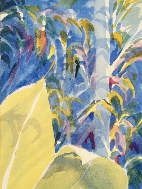
IMPORTANT: Whenever I go back in to add dark shapes, I look for shapes that are already there and just make them darker. I also look for ways to connect the darks or continue a gesture – to help the eye move through the painting.
I am not really calling this Finished. I’m calling it Finished for Now.