
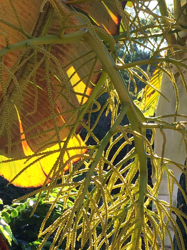
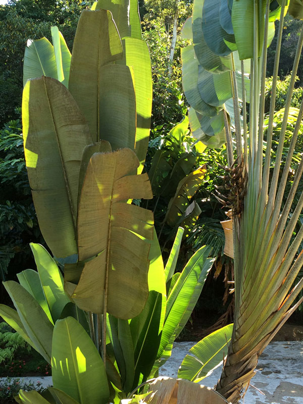
My use of what I call the ‘dancing stroke’ began its evolution when I moved to Costa Rica seven+ years ago. Everywhere I looked there were strokes of shapes – leaves – layers and layers of leaves. Coming from New Mexico, surrounded by light and air – I was suddenly in a quandary. How do I deal with the often cluttered landscape backgrounds I wanted to paint?
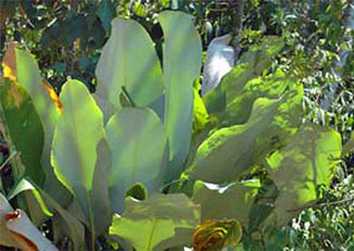 Eventually I began to understand a way. I found a way to create some order even if I was not seeing it. This photo of some leaves I particularly love became my self teaching tutorial. I called them the blue leaves and they are found all along the coast road next to the Pacific, just about 25 miles from my home.
I began to treat the foreground subject separately from the background jumble by with all the ‘negative spaces’ that were found tucked in between and just beyond the subject. I then began to create some order there along with the dancing stroke.
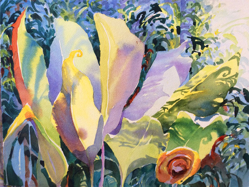
I painted them high key, low key, darkly, with mystery and in all different color schemes. Any way I could imagine – and always with the ‘dancing stroke’ in the background to simulate the jungle.
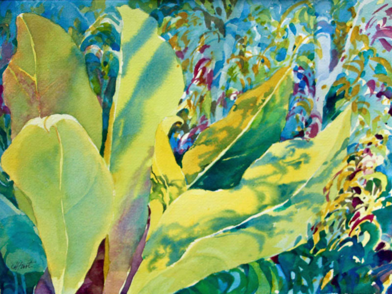
Dancing Stroke Demo – Overview
What I call ‘The Dancing Stroke’ is a background strategy that mimics the multilayered and ubiquitous backgrounds we see in the tropics. It can also be used in the dense woodlands of North America.
The painting process goes like this for this painting, Leaf Light.
Step 1. Foreground Subject Here in this painting, the subject is the leaves shaded and shadowed and backlighted in the foreground. I like painting the leaves one by one so I can enjoy the pleasure in the process of wet into wet, soft edges vs hard edges, changes in colors and intensity, etc. There are still a few more leaves to paint before I get into the background and dancing strokes. Now is a great time to start putting in the ‘dancing stroke’ background in the existing negative spaces.

Step 2. Dancing Strokes in Background. Using the dancing stroke technique, I fill in the negative spaces, using the same paints I’ve already selected for the color scheme – one by one. I begin with the yellow strokes. At this point, the background looks something like confetti – but the best is yet to come.

Step 3. Selective Glazing. It is the glazing that begins to push the background back a bit and allow the subtle structural cues (branches, some leaves, etc.) of the areas to emerge into view.