A Facebook post from Daniel Smith Watercolor Paints caught my eye.
Introducing 8 NEW Watercolors!
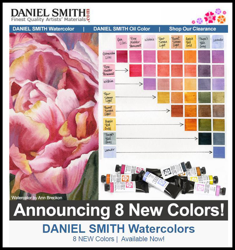
New paints? Exciting news for artists – and the link offered even more enticing names and expressive descriptions. Having been a long time customer and supporter of Daniel Smith I was interested. At least 80% of my paints are manufactured by this Seattle, Washington based company known for high quality products.
I clicked the link.
http://www.danielsmith.com/ItemList–DANIEL-SMITH-Watercolor–m-1451–Sort-5
The colors looked pretty and the listed names were intriguing, but not really informative – like – what was in each new paint? I wondered. And beyond that – Am I the only artist who wants to know more before buying a tube of ‘new’ paint?
I thought about my many students and considered that many may not know what is in that tube of paint or even how to find out. So often a painting that is ‘muddy’ is a result of the the paints used and not the painter.
Background Information
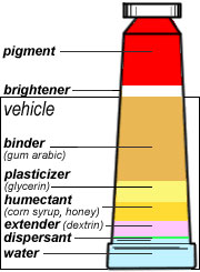 A Tube of watercolor paint contains just pigment particles in a paint vehicle. The microscopic pigment particles provide the color. The rest is in the paint vehicle that holds the pigments in suspension allowing them to be applied by brush to paper. They include: a binder, a plasticizer (usually glycerin), a humectant (a simple syrup like honey that helps hold moisture), an extender (thickener) and water.
- All manufactured paints must adhere to a regulated and standardized nomenclature system with the Color Index Name and number stamped on each tube. Often it is in very small print, but it must be there if the manufacturer is legitimate. (The Color Index Name and numerical system is standardized, regulated and disseminated by the Society of Dyers and Colourists London (UK), in collaboration with the American Association of Textile Chemists and Colorists (USA).
Example: Cobalt Blue PB 28
-
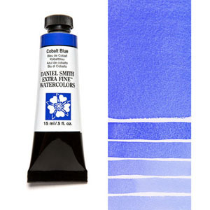
Cobalt Blue
Color Index Name: Cobalt Blue. Often named honestly, as in this case, for its technical chemical compound name, cobalt oxide.
- Numerical Index: PB 28 (P-Pigment (rather than a dye), B-Blue (one of the 10 basic color categories), 28- the number associated to its entry onto the list of blue pigments.
- Cobalt Blue, PB 28 is a single pigment paint. If the tube contained more than one pigment, each must be included.
Beyond this it gets more tricky. The Manufacturer wants to sell more paints and it is in his/her interest to create new and enticing paints that artists will want to purchase.
How? Some pretty creative ways:
Create a CONVENIENCE MIX
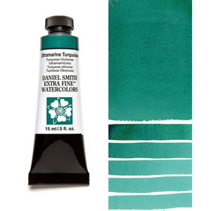
Ultramarine Turqoise
Mix pigments together in a paint and give it a new name. The mixed pigments are called ‘Convenience mixes’ because the manufacturer is doing for us what we could do ourselves. Truly some wonderful combinations are available – but the artist needs to be careful. A convenience mix is only as good as the quality of the pigments included AND how many there are AND whether they are complementary (creating neutrals) or analogous (creating strong hues).
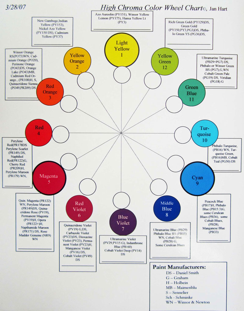
While most of the paints in my palette are deliberately single pigment paints, there are a few Convenience mixes I love. A favorite convenience mix of mine is Ultramarine Turquoise by Daniel Smith – which is a convenience mix of Ultramarine blue (PB29) and Phthalo Green (PG7) – two very strong and brilliant paints with high intensities. They are also adjacent to each other on the color wheel, enabling the resulting mix to be both intense and a strong hued. (Green and Blue are Analogous on the color wheel).
Reference: Jan Hart Color Wheel (available here or through my website under Freebies)
Often I mix this paint with another intense paint – Quinacridone Sienna – to get various varieties of dark, natural greens that I see in nature. I can push the mix toward the sienna for a more olive green or toward the ultramarine turquoise to get a darker, cooler green.
Many neutral hued paints (grays or browns) are convenience mixes of two or three pigments that are NOT adjacent on the color wheel. Popular examples are Moonglow and Shadow Violet by Daniel Smith.
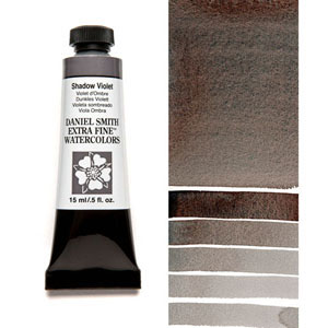
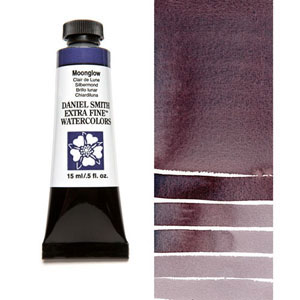
Shadow Violet is a Convenience mix of Pyrrol Orange (PO 73), Ultramarine Blue (PB 29) and Viridian Green (PG 18) Another Convenience Mix is Moonglow (the same mix of Viridian and Ultramarine Blue with some Anthraquinoid Red (PR 177) added instead of the orange. Both are exciting neutrals to watercolor artists who like seeing the pigments separate out in a wash, mostly the Ultramarine blue settling into the paper – and choose not to do it themselves.
Okay. But each of these contains three pigments. Mixing too many pigments together in a mix runs the risk of creating ‘mud’. Just imagine that mixing together two paints, each contain three pigments means creates a mix of six pigments! It may be really difficult to see the beauty of any of the individual pigments in a many pigment mix. And my concern as a watercolor teacher is also for the beginning student wandering through the art store thinking that ‘Shadow Violet’ must be needed for shadows and ‘Moonglow’ must help create mystery…. Names can be misleading and misdirecting.
Awhile back Holbein, a very reputable paint manufacturer created an entire new group of 48 paints it named the Antique palette, all Convenience mixes with new names and several with Titanium white added (PW6). Antique Opal Green is beautiful and is a convenience mix of Phthalo Green and Titanium white, which is very opaque.
![]()
Antique Opal Green
Create a NEW NAME
A single pigment can be manipulated in the lab through heat or chemical means to alter its appearance. Essentially this is the case with Raw Sienna (PBr7) that is is just heated more to create Burnt Sienna (PBr7).
Or – it can just be re-named. It is not uncommon for the unwary artist to find several PV19’s in one’s palette, all with different names.
PV 19 is Gamma Quanacridone. Mostly it is called Quinacridone Rose – but it has other names too.
- Permanent Rose – Winsor Newton and Rowney and DaVinci
- Quinacridone Red Winsor Newton
- Quincridone Red – Daniel Smith
- Rose Lake – MaimeriBlu
- Ruby Red – Schmincke
- Royal Purple Lake – Old Holland
- Quinacridone Violet – Graham, Daniel Smith and Utrecht)
- Red Rose Deep – DaVinci
- Permanent Magenta – Winsor Newton
So my cursory glance at the eight new watercolors got me wondering what they really were.
Always my best reference is Bruce MacEvoy online at handprint.com for the most thorough review of watercolor paints including testing, naming, etc. Though the manufacturers are putting out new paints with new names so fast it is hard to keep up – I can still find out quite a bit.
I started through the list of 8 with questions.
Rose Madder Permanent
- Could this be a good permanent substitute for one of my favorites, Rose Madder Genuine (WN) which is a beautiful pale warm transparent rose so useful for glazing but often vilified for its impermanence? I prefer Winsor and Newton’s version. I found the answer.
- Answer: A convenience mix of three Quinacridone pigments Quinacridone yellow red (PR 209), Quinacridone Red (PV 19) and Quinacridone Magenta (PR 202). Yes, it is definitely permanent but I’m not convinced about its substitution for Rose Madder Genuine.
Quinacridone Lilac
- A new Quinacridone paint? The quinacridones have been long time favorites, though I had not encountered any in the blue or lavender range.
- Answer: (PR 122). It is Quinacridone Magenta, apparently just chemically ‘cooked’ a little differently in the lab and renamed.
Wisteria
- No idea about the contents though the name is enticing.
- Answer: (PW6, PR122) Here again is Quinacridone Magenta (PR 122) with some PW6 or Titanium white added in. The addition of Titanium white adds an opaque pigment and the artist needs to know that if he/she is choosing to work in transparent watercolor.
Lavender – No idea about the contents.
- Answer: (PW6, PV15, PB29) A three pigment convenience mix containing Titanium white as well as Ultramarine blue and Ultramarine violet. Not good if transparency is desired.
Aussie Red Gold – No idea about the contents.
- Answer: (PY83, PR101, PV19) Or a mix of diarylide yellow (a semi-opaque yellow pigment mostly used in convenience mixes), synthetic red iron oxide and quinacridone rose. A 3 pigment convenience mix.
Raw Sienna Light and Burnt Sienna Light
- Both Raw Sienna and Burnt Sienna are iron oxide or ‘earth’ paints that and long time favorites worldwide. They do not exactly stand for specific pigments or colors in the way that ultramarine blue or viridian do. They stand for a traditional color concept that each paint manufacturer interprets in their own way, using varieties of iron oxide with loosely defined chemical or color characteristics. I wondered what changes had been made to warrant the addition of ‘Light’.
- In both situations, the name had been applied to a new Convenience mix:
- Raw Sienna Light: Traditional Raw Sienna (PBr7) had been left behind. Mars Yellow or Gold Ochre (PY 42) was now renamed as Raw Sienna Light. The sheer diversity of earth paints on the market today makes it hard to understand the basic color concept each type of pigment represents. This page explains the key differences and defining features. https://www.handprint.com/HP/WCL/earthp.html At least it was a single pigment paint.
- Burnt Sienna Light Traditional Burnt Sienna (PBr7) had been left out. Changed to a convenience mix: Venetian Red or Transparent Brown Oxide (PR101), Quinacridone Orange (PO48)
Payne’s Blue Gray –
- I know what Payne’s Gray is – a Convenience mix of Ultramarine Blue (Pb60) and Lamp Black (PBk6). As far as I can determine Payne’s Blue Gray is the same. Perhaps it is pushed a bit more in the direction of Ultramarine blue. And renamed.
In case you are interested, below is a list of my current favorite paints which are mostly single pigments. They are arranged in color families in accordance with Bruce MacEvoy’s color families and my own color wheel, available on my website.
https://janhart.com/jan-hart-high-chroma-color-wheel-2007
- Light Yellow: Azo Aureolin (PY 151) or Lemon Yellow (PY 175)
- Yellow Orange: New Gamboge (PY 153) or Nickel Azo Yellow (PY 150)Daniel Smith)
- Red Orange: Quinacridone Siena (PO 49, PR 209) or Perinone Orange (PO 43)
- Red: Perylene Scarlet: (PR 149)
- Magenta: Quinacridone Magenta (PR 122) and Rose Madder Genuine for glazing (NR 9) Winsor Newton)
- Red Violet: Quinacridone Violet (PV 19)
- Blue Violet: Indanthrone Blue (PB 60)
- Middle Blue: Ultramarine Blue (PB 29)
- Cyan: Cobalt Blue (PB 28)
- Turquoise: Phthalo Turquoise (PB 16)
- Green Blue: Ultramarine Turquoise (PB 29 + PG 7)
- Yellow Green Rich Green Gold (PY 129)
So for now I don’t need any of the new paints. I have all the colors I need.
And just as I was wondering what the Manufacturers would come up with next, I happened to see an addition to the Daniel Smith online catalog – some more paints I will not be buying. The Holiday Scented Watercolors.
Come on. I cannot even find out what pigments are used!
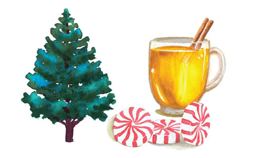
Description: “These delightful additions to your holiday palette have been created with the same high-quality pigments that we use in all of our watercolors, but we’ve added Holiday fun!
They’re fragrant with heart-warming and familiar holiday scents. It’s something a little special for you while you’re creating your Holiday cards and artwork this year! The yummy smell can be enjoyed while you’re painting, and for about a day afterwards. Delight an artist friend or family member with these special paints!
- Candy Cane Red
This vibrant, peppermint-scented red is made for holly berries, Santa suits, and reindeer noses. Powerful and transparent, it looks and smells so good that it just might become one of your favorites! Limited Edition. - Christmas Tree Green
Gather family and friends to create holiday artwork with quality paints infused with fun, festive fragrances. Start with this classic fir-tree green that releases fresh pine-forest scent with every brushstroke. Limited Edition. - Hot Mulled Cider Yellow
Rich with the fragrance of apples, cinnamon and cloves, this warm, neutral golden yellow is ideal for painting ribbons, stars and crackling fires. Limited Edition.”
To be fair, Winsor Newton opened the fragrance ‘can of worms’ with a faintly detectable perfume of roses that accompanied the opening of a tube of Rose Madder Genuine. Never mind that the pigment was naturally derived from the odorless madder root.
Buyer beware for sure!

Hi Jan,
Thanks for a great analysis of pigment contents.
As you say, it can be tempting to go for the pretty colors which we may be better off learning to mix for ourselves. Paint is expensive, so I have usually tried to stick to 8 or so basic colors. Doesn’t always work – sometimes temptation wins.
You are welcome! I think it is always great to leave a bit of room for temptation! Kind of like dessert! Still a steady diet of 8 or so basic paints wins the day for me!
In case anyone is interested,
Candy Cane Red is Quinacridone Red PV19 + scent
Christmas Tree Green is Cascade Green PRr7, PB15 + scent
Hot Mulled Cider Yellow is Nickel Azo Yellow PY150 + scent
and
Rose Madder Genuine is traditionally scented with Bergamot (like in Earl Grey tea) rather than roses, but it smells very similar to roses and is enjoyable to paint with as it’s a luminous pink color though has low lightfastness.
Thank you Ellie! I didn’t know about the scents you listed except for the Rose Madder Genuine which has been scented for as long as I’ve used it. I appreciate the news and likely others will too!