Suggested Supplies for the Workshop with Jan Hart
The following materials are recommended for this workshop. Of these, the paper, brushes and the paints with • are the most important and should at least get you started. I am including all of the paints in my palette, for your information and purchase guide. Please email me if you have questions about the materials – or anything else. I use a lot of Daniel Smith paints, which are marked with (DS) Jan Hart jan@janhart.com. I know that it is sometimes difficult to be sure your paints will all get to the workshop – but sending them separately is NOT recommended at all for Costa Rica and carrying them with you doesn’t always work. I put my palette in a plastic bag in my checked luggage, along with brushes, paper, etc. And so far it has worked just fine.
- Small sketchbook, 5″x 7″ o.k. – For value studies, etc. Strathmore 70# or equivalent is fine.
- Drawing Pencil (HB suggested), Black colored pencil for value studies – I like Berol Prismacolor black pencils.
- Eraser (white Staedtler Mars or kneaded eraser)
- Watercolor Palette. Plastic, with lid preferred – i.e. I like the Cheap Joe’s Piggy Back palette. www.cheapjoes.com Watercolor Brushes. (1) 1 – size #6 or 8 round*, (2) size #12 or 14 round*, (3) wash brush – 1/2″ or 3/4″ , flat*. I do 90 % of my work with one of the flat wash brushes and love using the corners and edges for most of what I do. like the synthetic brushes by Daniel Smith that are inexpensive and I love even more the mixes – i. e Squirrel/Synthetic or the Sable mix brushes. Three brushes should do it all! I also like to have along a rigger….just because…..you never know when you really need a rigger..
Watercolor Paper
2 – 3 full sheets (22″ x 30″) – 140# . Good paper is really important. Arches cold pressed & Fabriano Artistico are my current favorites. We’ll work initially on 1/4 sheets so you can cut the large sheets into 4 small ones or you can get a watercolor block (10″ x 14″ ok) I recommend cold pressed blocks. If you bring a watercolor block you do not need to bring a drawing board. I sometimes take a block to paint on when I travel but I prefer paper sheets that I can tape down. Not sure why – but they seem to work better.
Watercolor Paints
Daniel Smith, Winsor Newton and Graham paints are especially good brands to choose from – and I use many Daniel Smith watercolors for their overall quality. I may have some of my favorites with me to show/possibly sell.
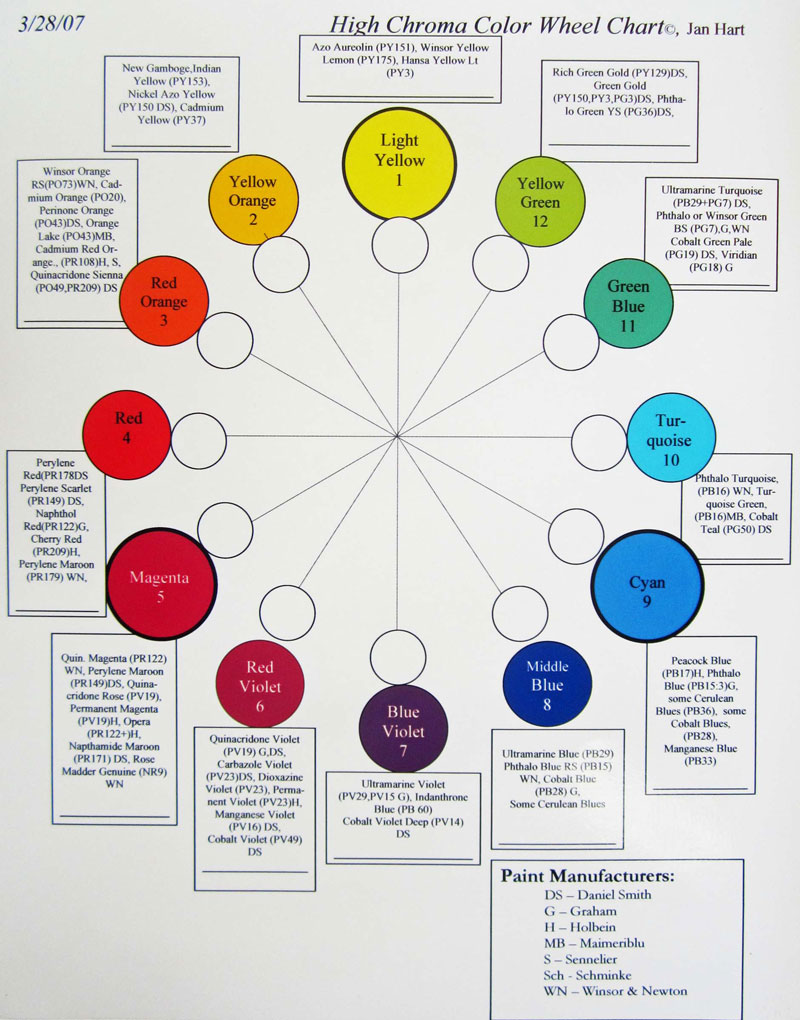
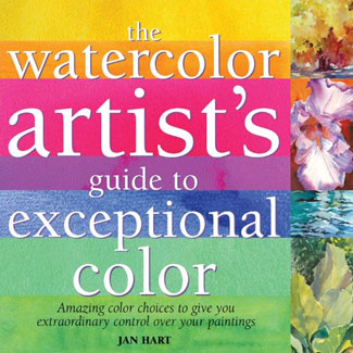
I will be discussing pigments and their characteristics throughout the workshop, which is the basis for my book, The Watercolor Artist’s Guide to Exceptional Color. You can find a copy of my color wheel in the book or click here to view an online version (that isn’t as crisp as I’d like) Those pigments with (DS) are Daniel Smith paints. Those marked with * are specialty pigments – i.e. interesting sedimentation, incredible color, etc. and my absolute favorites. As part of the workshop, we’ll be using and talking about my Color Wheel, which includes these 12 pigment color families. It’ll be great if you have one paint from each ‘family’ number – and you probably already do! In the Magenta and Red Violet categories you will see more than one with a * because they each are very different and I use them all. I have added comments to the paint suggestions based upon my preferences.
You can download a copy of this color wheel through my Online Store under Freebies
Light Yellow
*Azo Aureolin Yellow (Graham) or Hansa Yellow Light or Winsor Lemon (WN) or Aureolin Yellow (DS) I prefer to use Aureolin Yellow by Daniel Smith. It is nicely transparent- or the Graham Azo Aureolin Yellow.
Yellow Orange
New Gamboge or *Nickel Azo (DS) or Indian Yellow One of my favorite paints is Nickel Azo Yellow (DS) because it is clear, bright and pushes other pigments – adding interest and variety! I also like New Gamboge – have both. Quinacridone Gold is also a great paint – I just don’t use it as much. (also it is now discontinued, though the paint manufacturers have plenty stockpiled.)
Red Orange
*Quinacridone Sienna (DS) or Winsor Orange or Cadmium Orange or Perinone Orange. Hands down Quinacridone Sienna for me. Clear, bright, and mixes with Ultramarine Turquoise to make the best greens for nature! I do have some Perinone Orange and Cad orange in my palette if I ever need a bright note that stands alone.
Red
Perylene red, *Perylene Scarlet or Perylene Maroon or Naphthol Red or Cadmium Red. I use one red – Perylene Scarlet – bright, pure, etc. but most of the time I don’t use red. I like magenta with a bit of Nickel Azo for any reds….
Magenta
*Quinacridone Magenta PR122 (DS) or Alizarin Crimson or *Opera (Holbein) or Quinacridone Rose. *Rose Madder Genuine (good especially for glazing) You might want to bring two in this category…. I love Quinacridone Magenta (DS) as well as Rose Madder Genuine for Glazing. Only use Rose Madder Gen. by Winsor Newton – much better color than DS. Quinacridone Magenta is an all out favorite paint for me – deep, strong, dark and alive.
Red Violet
*Quinacridone Violet, Dioxazine Violet, *Manganese Violet (DS) or Thio Violet or *Cobalt Violet (I actually use Manganese Violet (now discontinued), Quin Violet and Cobalt Violet – because each is so different!) I do have Qjuinacridone Violet in my palette and use it but don’t use much of the other violets because I can mix them. Still Cobalt Violet (Daniel Smith or Winsor Newton) is a must for me. It is gummy and difficult to use, but oh the color and sedimentation it gives in the right places!
Blue Violet
Ultramarine Violet or *Indanthrone Blue or Cobalt Violet Deep (DS) I very much love Indanthrone or Indanthrene blue – Daniel Smith or Winsor Newton. This is a dark, strong and very easy to work with blue – very different from Ultramarine or Cobalt…
Middle Blue
*Ultramarine Blue, Phthalo Blue, Every watercolor artist has to have Ultramarine blue or French Ultrmarine blue! French ultramarine is simply slightly warmer than regular – same pigment. Must have one or the other.
Cyan
Peacock Blue (H), Manganese Blue, Cerulean Blue, *Cobalt Blue (WN or DS). I like Cobalt blue (DS or WN). I also have cerulean blue in my palette just because I might need it. It is opaque, but – just like the cadmiums – can add an amazing note when needed…. Peacock blue by Holbein is amazingly rich, strong, etc. I keep thinking I’ll need it and don’t.
Turquoise
Phthalo Turquoise (WN), or Cobalt Teal Blue (DS) I keep Cobalt Teal Blue in my palette along the same way I do for the cadmiums and cobalt violet – an amazing note of a bright, opaque dazzling color to finish off a piece!
Green Blue
*Ultramarine Turquoise (DS) or Phthalo Green (Blue Shade) Hands down favorite – Ultramarine Turquoise (DS). This paint is a convenience mix of ultramarine blue and phthalo green – and is a fabulous color, rarely if ever seen in nature. Still – mixed with quinacridone sienna it makes the best greens of nature – and can be pushed toward sienna or towards the turquoise in a direct mix that is exhilarating! If my house was on fire I’d probably have to run back in for Ultramarine Turquoise!
Yellow Green
*Green Gold (DS), or Phthalo Yellow Green. My favorite is Green Gold by Daniel Smith – as it contains Nickel Azo yellow! A fabulous paint for bright new growth greens!
There are other specialty pigments use – not as much for color as for what they do!
Pigment Characteristic
- Cobalt Violet (DS) • Sedimentary and transparent
- Lunar Black (DS) Sedimentary, non staining – with fantastic gran.
- Manganese Violet (DS) Sedimentary, non-staining, nice granulation. No longer available but I love it still…..
- Napthamide Maroon (DS) * permanent, wine purple – wonderful in trees…but pretty darkly neutral….
- Nickel Azo Yellow (DS) perm, staining, intense – surprise reactions, too
- Rose Madder Genuine (Winsor Newton) * transparent, non-staining (and a lot prettier than the DS Rose Madder Genuine)
- Ultramarine Turquoise (DS) • permanent, staining
- Quinacridone Gold (DS) or Raw Sienna • Semi-transparent
- Quinacridone Sienna hot red-orange, permanent, transparent
- Zoisite Genuine (DS) amazing sedimentation with pale gray-green undertone
Limited Palette of Must Haves
I realize there might be an overwhelming amount of information here. So – if I decided to pack a limited number of paints – say 12 – what would they be? (Be sure to check the tiny print pigment number on the tube you purchase)
- Aureolin Yellow (PY 151)
- Nickel Azo Yellow, (PY 150) (DS)
- New Gamboge (PY 153)
- Quinacridone Sienna (PO 49, PR 209)
- Quinacridone Magenta (PR 122)
- Rose Madder Genuine (NR 9) (WN)
- Indanthrone Blue (PB 60)
- Ultramarine Blue (PB 29)
- Cobalt Bllue (PB 28)
- Ultramarine Turquoise (PB 29, PG 7)(DS)
- Green Gold (PY 150,PY 3,PG 3) DS
- One more you just cannot live without
- Wood board or Gator Board to attach paper to. This should be slightly larger than your paper size. i.e. a quarter sheet of watercolor paper measures 11″ x 15″. The board could be 12″ x 16″. Or a watercolor block and forget the need for a board. I am enjoying painting on Aquaboards, too – in case you might want to try that out!
- Drafting tape or masking tape and Paper Towels. Please do not bring the blue tape….it interferes with our eyes when we evaluate… Be aware that no tape or paper feels the same in Costa Rica as it does where you live – but it works.
- Water containers Collapsible ones are terrific.


