We were a few days into the first Intensive of 2018. Two exuberant students, both from Florida and they had zillions of questions. We covered paints and color relationships and suddenly they both wanted to know more how to approach a palm tree! With questions like:
- How to paint a frond without painting each and every leaf.
- How to paint a palm frond in light.
- What about those palm fronds that come forward?
I began by showing one of my narrated slide shows of the subject entitled ‘Painting Palm Play’ that provides a narrated step by step process. That was helpful, they said but they wanted a demo. Okay.
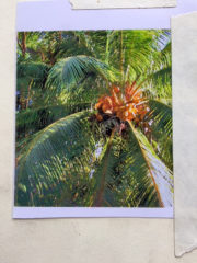 From several palm photos, we selected one because of the light, the coconuts and the ample opportunities to deal with so many many leaves without painting them all.
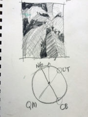
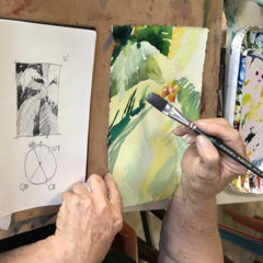
Preparation First I cropped the photo for a more pleasing composition. A value/composition sketch was done in Prismacolor pencil so I could see and plan the darks and the lights. I paid special attention to the frond that was coming forward, foreshortened just above and left of the coconut cluster.
 Then we selected a color scheme – a tetradic, which is one of my favorites. I knew that the combination of Quin Magenta and Ultramarine Turquoise could achieve any dark darks that I needed and the New Gamboge could provide greens when mixed with the cobalt blue and the Ultramarine Turquoise. I also knew that I would need cobalt blue for glazing. Then I announced that I would cheat and add in Aureolin yellow, which would be an under glaze (for sunshine) .
I was ready to begin.
Process I began with an all over under-wash of Aureolin yellow – to establish the sunlight. Then – jumping in with ‘Lightest or brightest or scariest first!”. Intensifying some of the fronds that I wanted to be fully lighted and allowing myself to play a bit as I work frond to frond..
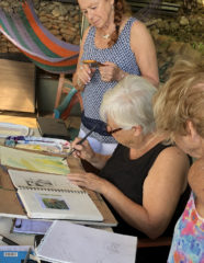
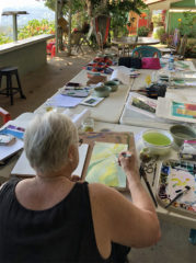
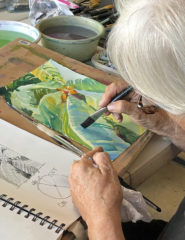
One of the students took the opportunity to snap photos as I progressed and her work provided a variety of views of the process.
 I stressed painting the shapes I see as I go. Each shape has edges, which must be either hard or soft. Painting in some mid tone greens offers the opportunity to paint some positive shapes (objects) or negative shapes (shapes in the background). And each shape painted in helps define edges of the adjacent shapes. So – frond by frond the painting is built up with both positive shapes and negative shapes. Always, the adjacencies! And also careful attention to the value/composition ‘map’ and the photo for reference.
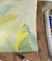
 Now that the basics were down, some attention can be paid to each frond. Working through one at a time, I layed in some leaf indications, careful not to do too much. The viewer can ‘fill in the blanks’ once I give some suggestions. I am continuing to use my ½” flat wash brush to indicate just a few of the individual leaves in a negative painting kind of way. Here I am using a mixed dark green.
Glazing
I like to imagine glazing as if I was lightly and carefully placing a transparent film over an area. A glaze. I decided the lower left frond could go just slightly darker and cobalt blue, our most transparent blue could provide it. I decided I would stay away from the central spine of the frond that was still without paint – just to keep my options open and adjacencies contrasting. I can always cover up any too light areas later. Mixing up a puddle of cobalt blue, I started in wanting to touch the area only once with my wet brush in order not to pull up any of the underlying dry paint.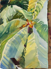
 Adolescent Critique. Since I was not beginning to think about finishing touches, I knew it was a good time to step back and take a good look at what was needed next. Often we are closer to finishing than we think we are. Our verbal left brains tell us all the little things we should do. Our non-verbal right brains whisper from a distance about just two or three things yet needed.
My right brain whispered just three things
- Stronger blue in the sky areas
- Some detail work in the coconuts along with some oranges elsewhere
- After that – wait awhile before you do anything else.
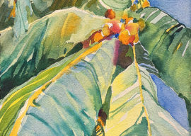
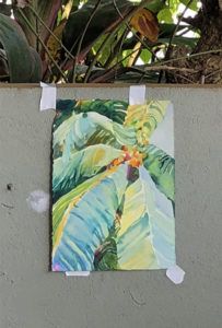
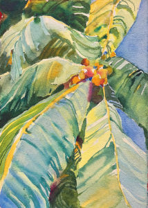
Here is where it is today. I’m very pleased with the looseness, the way my eye moves around the painting and with the color relationships. Did I successfully show a palm frond coming forward? No. I lost track of that while I was painting. But I can work on it if I think it needs it – or remember it next time.
Email me if you would like a copy of the palm photo jpeg and I’d love it if you’ll share your work with me!
Join Jan in an Intensive at her home in southern Costa Rica for 2019. Check it out.

Wonderful seeing your process as you’re thinking the stages through and verbalizing as you move along. Just beautiful, Jan! Inspiring.
Thank you, Wendy. As you know, I simply cannot keep my thoughts to myself as I paint…. 🙂